![]()
How to Improve the Alphabet
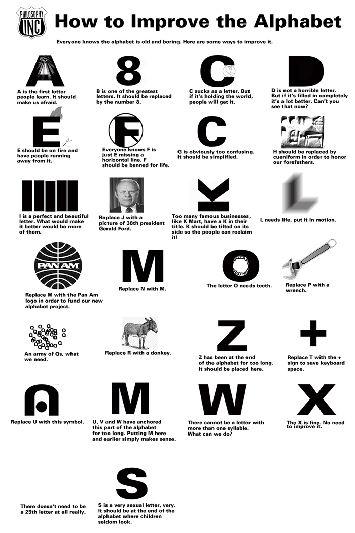
Chris Cobb curated an event for Marginal Arts in 2014 called Letterhead which had the theme of using letters or typography as inspiration for an artistic piece. One of my favourite activities is prankish communication that takes a serious tone but reports something ham-fisted. So, for Letterhead I designed a new and improved alphabet.
Creating art for public consumption is so strange - I undoubtedly received more positive feedback for this poster than practically anything else I've ever done.
Here's a link to an 11x17 pdf version.